Demand Charges can make up, up to 50% of a commercial energy bill. What are they? How do they affect you? What effect will solar have?
What Is Peak Demand?
Peak demand is the maximum amount of power drawn by a user. In simpler terms, it is the moment when you are using the most electricity. You could imagine for a pub this might be in the height of summer when their cool room and air conditioner are working extra hard, all of the TVs are on, the fridges are being opened constantly, and the kitchen is at full capacity. This is the moment in the year when the most electricity is being pulled into their building.
What Are Demand Charges?
On the same hot summer day, you could imagine that every house in town will also have its air conditioner running, which means they’re probably pulling the most electricity for the
year as well. This causes a problem for the electricity network. They need to build the network to be ready for these days of high electricity demand, requiring costly infrastructure. In order to recover these costs, the networks charge their customers based on their peak demand.
How Are They Charged?
The way that demand costs are passed on to the customer depends on the network and the tariff the customer is subject to. The unit of measurement is kVA (kilovolt-amps) or kW kilowatts), and the customer is charged a price per kVA or kW per day in the billing period. A few common methods are:
Annual Peak Demand: Customers are changed based on the highest recorded demand in the previous 12 months.
Monthly Peak Demand: Customers are charged based on the highest recorded demand in the previous month.
High/Low Season Demand: Customers are charged a different rate depending on the time of year the bill is for, typically summer periods incur higher demand charges.
How Can Solar Save You Money on Demand Charges?
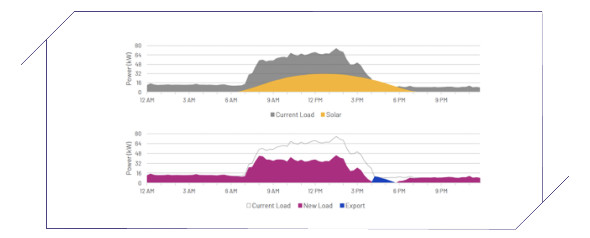
Solar power offsets the electricity that you would otherwise draw from the grid. If your peak
demand is occurring during daylight hours, that peak will be reduced by the amount of power the solar is producing at that time. If we look at the graph below, the first graph shows the load profile of a business in grey, which ramps up at 7am, has a few peaks throughout the day, and ramps back down at about 4pm. You can see that the highest point is at ~75kVA. The yellow represents what a 40kW solar array would be doing at that same time. The second graph then shows what happens to the load when the solar is used to reduce that load. As you can see, the new peak demand is ~45kVA, a reduction of 30kVa, or 40%.
How Are Demand Savings Included in Our Analysis?
In our analysis (presented in your Energy Data Analysis) you will see graphs similar to the one above,
as well as others that show demand changes. The extent of the demand savings depends on multiple factors, such as your energy usage profile, the weather and the tariff structures.
We base our analysis on the past 12 months of data. We layer real historical BOM data against what your usage would have been given the weather conditions that occurred on that day. This gives us an accurate picture of how much you could have saved in
the past year if you had solar installed. This is what we use to predict your demand savings, which is then built into our charges and ROI figures.


